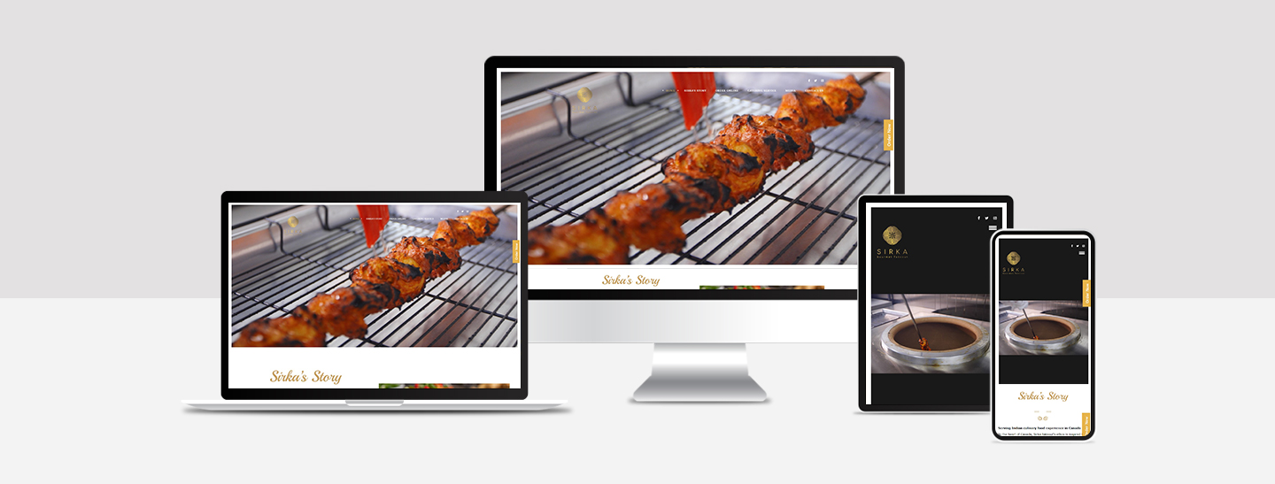
Sirka
Helping Sirka Stand Out with Branding and Design
Background:
Sirka is a bold and modern Indian restaurant based in Canada, founded by Chef Kanwardeep and Chef Baldeep. Inspired by the nostalgic flavor of “sirka wala pyaaz,” Sirka aims to offer unapologetically authentic Indian food with a premium and creative touch. They wanted a brand identity that would connect with the local market while staying true to their roots.
Challenges:
Standing Out in a Competitive Market
In Canada’s growing food scene, Sirka needed a brand identity that stood out and clearly communicated their quality, culture, and originality.
Creating Packaging that Speaks
They needed packaging that looked premium, shared the brand story, and provided clear product information—while also appealing to modern consumer preferences.
Solutions:
We supported Sirka in the following ways:
- We researched Sirka’s story, values, and customer appeal, then created a unique logo, color scheme, and font style that reflected their bold and elegant identity.
- We developed marketing materials like brochures and business cards to ensure brand consistency across all touchpoints.
- We designed product packaging with attractive visuals, easy-to-read labels, and selected eco-friendly materials to match current market standards.

Result:
Clear Brand Look
The new branding helped Sirka build a strong and memorable image in the Canadian market. People could easily recognize the brand.
Attractive Packaging
The packaging made Sirka’s products stand out on store shelves. It looked good and made it easier for people to pick their products.
Good Customer Feedback
Customers liked the simple and clean packaging. It helped build trust in the brand and led to more interest and better sales. (edited)
Found Something Interesting?
Talk to an expert. We’d love to hear from you.
