

May 5, 2025
Differences Between Responsive and Adaptive Web Design
In today’s digital landscape, where users access websites on a multitude of devices, having a website that offers a seamless experience across different screen sizes is crucial. This is where web design approaches like responsive and adaptive design come into play. Both techniques aim to optimize a website’s performance and usability on various devices, but they do so in different ways. Here’s a breakdown of the key differences between responsive and adaptive web design.
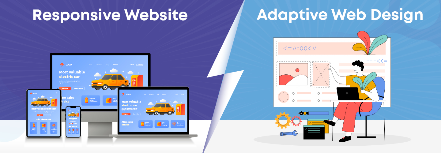
What is Responsive Web Design?
Responsive web design is an approach where a website’s layout and elements dynamically adjust to fit the screen size of the device being used. It relies on flexible grids, fluid images, and CSS media queries to ensure that the website looks and functions well on any device, whether it’s a desktop, tablet, or smartphone.
Key Features of Responsive Web Design:
- Fluid Grids: The layout is based on a flexible grid that automatically resizes according to the screen size.
- Media Queries: CSS media queries detect the user’s screen size and resolution, allowing the design to adapt accordingly.
- Flexible Images: Images and media elements resize proportionally to fit the screen.
- Single Layout: There’s one layout that adjusts fluidly, providing a consistent experience across all devices.
What is Adaptive Web Design?
Adaptive web design, on the other hand, involves creating multiple fixed layouts for different screen sizes. Instead of adjusting fluidly like responsive design, adaptive design detects the user’s device and loads the appropriate layout for that specific screen size.
Key Features of Adaptive Web Design:
· Multiple Fixed Layouts: Designers create distinct layouts for different screen sizes, typically targeting specific breakpoints (e.g., 320px, 768px, 1024px).
· Device Detection: The website detects the user’s device and serves the corresponding layout.
· Custom Experience: Because the layout is tailored for specific devices, the user experience can be more customized.
· Performance Optimization: Adaptive design can lead to better performance on certain devices, as the design is optimized for each screen size.
Key Differences Between Responsive and Adaptive Design
Approach to Layout:
- Responsive Design: Uses a single flexible layout that adjusts fluidly to fit any screen size.
- Adaptive Design: Utilizes multiple fixed layouts, each designed for a specific screen size or device.
Flexibility:
- Responsive Design: Offers more flexibility as it adapts to any screen size, even those that weren’t initially considered.
- Adaptive Design: Less flexible, as it relies on predefined layouts that may not accommodate unexpected screen sizes.
Implementation Complexity:
- Responsive Design: Generally requires a more straightforward implementation with a focus on CSS and media queries.
- Adaptive Design: Can be more complex to implement, as it involves designing and coding multiple layouts.
- Responsive Design: Provides a consistent experience across all devices, though it might not be fully optimized for each one.
- Adaptive Design: Allows for a more tailored experience, as each layout is designed with the specific device in mind.
Performance:
- Responsive Design: May result in slower load times on smaller devices since the same assets are often loaded across all devices.
- Adaptive Design: Can improve performance by serving optimized content and layouts specific to the device.
User Experience:
Choosing Between Responsive and Adaptive Design
- The choice between responsive and adaptive web design depends on your specific project requirements, audience, and resources.
- Responsive Design: Ideal for websites that need to accommodate a wide range of devices and screen sizes. It’s often easier to maintain and is generally more cost-effective.
- Adaptive Design: Suitable for projects where a tailored user experience on specific devices is critical. It can offer better performance and a more customised feel, but it requires more design and development effort.
Both responsive and adaptive web design have their own advantages and challenges. Responsive design is more fluid and offers a universal solution that adapts to any screen size, making it a popular choice for most websites. Adaptive design, however, provides a more personalized user experience by offering multiple fixed layouts optimized for specific devices. The decision to use one over the other should be based on your website’s goals, target audience, and the resources available for development and maintenance. If Need a Website Designing Company in Delhi NCR? We are experts in ecommerce website design. Contact us for professional and creative web design services!
Comments
No comments yet. Be the first to comment!